The Apple Podcasts artwork you really need - part 1/2
Deciphering Apple’s confusing design specs
Well hello!
I’ve been working on a podcast rebrand over the past week or two and in the process of commissioning the new artwork I realised just how confusing Apple’s design specs are.
When I tried to explain to our designer - who is not a podcast native - what was required, it became clear that while they tell you what you need to upload, Apple do a really bad job of explaining why you need so many different iterations of your artwork or how they are used.
So I thought it would be helpful to pull together a clear and comprehensive guide to all the different ways Apple display your podcast artwork, and how to optimise the various iterations so that you make the most of the free marketing real estate available in the Apple Podcasts app.
This is part one of two. In this email I’ll explain all the different places Apple Podcasts displays your artwork and how it shows up in the app.
In the next issue, I’ll discuss how you can optimise your artwork for the different display surfaces, including one very important thing that almost everyone seems to get wrong. So, stay tuned next week for that.
Without further ado…
Where Apple Podcasts shows your artwork
Apple podcasts surfaces your artwork in a variety of places across the platform. If you optimise your artwork for all the different iterations Apple can surface, you make the most of this opportunity to get your podcast branding in front of as many users as possible and maximise your impact.
Here’s the artwork you can upload to promote your podcast feed:
Feed art
Episode art
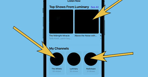
Channel art
Channel icon
Featured art
New and Noteworthy
Full page feed art
This artwork displays in a wide variety of places across the app. I’ve spent the time scrolling through the app to collate and list these so you don’t have to.
Apple podcasts Home Screen
This is the first screen you see when you open the Apple Podcasts app. Here’s how podcast artwork displays in this screen:
Up next
If you have podcasts you already follow (or episodes you have started listening to), the first thing you see when you open your Apple Podcasts app is the Up Next carousel. These large, impactful images are drawn from either the podcast feed art, or the episode art.
Subscriptions & Recommendations
Scroll down on the Home Screen and you are presented with a selection of podcasts and episodes from channels you subscribe to, or which Apple recommends to you. These images are drawn from the podcast feed art.
There is an editor’s choice carousel titled ‘We’re Loving’, which features artwork in a similar format to the Up Next carousel at the top of the page.
You’ll notice some of the podcasts here display artwork in the full frame of the carousel, while others display the basic square icon.
This is determined by whether or not the feed has full screen feed art enabled. I’ll tell you how to do this next week.
Channels to try
Scroll further on the homepage and you’re presented with a carousel of channels you might like. The images here are taken from the channel art.
Tap on any of the icons on the home screen and you’ll be taken to the following:
Episode play screen
Tap on any ‘up next’ icon and you’re taken to the episode play screen for a single episode of that podcast.
The large image you see at the top is taken either from the episode art (if specified), or the feed art (if no episode art is specified).
Podcast feed screen
Tap on any show icons from the Home Screen, or tap on the podcast name in an episode, and you’re taken to the podcast feed screen.
The image you see at the top is the feed art. By default, all podcasts display their feed art in a small-ish square.
You’ll have noticed, though, that some podcasts have full screen feed art. I’ll show you how to get this next week.
Apple Podcasts Browse Screen
The second screen in the bottom menu in the podcast app, this features some of the most coveted promotional slots of all.
Featured shows
At the very top of the Browse screen you’ll see a carousel of large rectangular images filling almost the whole screen.
These are Apple-curated features, and the artwork used here is taken from the Apple Feature art.
This is some of the most coveted real estate in the apple podcasts app, and is well worth investing in.
Featured episodes
Scroll down and you’ll see another Apple-curated carousel, this time recommendations for specific episodes.
Like the Up Next carousel on the Home Screen, the images taken here are from the episode art (if specified), or the feed art (if no episode art is specified).
New and Noteworthy, Top Shows, Top Episodes
Scroll further and you’ll be offered the curated New and Noteworthy list (another coveted slot) and a selection of top shows and episodes. These all draw their icons from the podcast feed art.
However the New and Noteworthy slot requires its own submission for consideration with its own art specs which I’ll detail next week.
Further down you might find additional curated recommendations, in the same carousel format as the Up Next section. Once again this is likely to draw on the feed art.
Library
In your library screen you’ll find all the shows you follow. These images are take from the feed art.
You can also access the channels you follow or subscribe to. These icons are taken from your channel icon.
Now we’ve established where your artwork displays, we’re ready to discuss how to optimise your designs. That’s coming next week in Podcast Strategy Weekly.
Actions you can take right now
Scroll through the Apple Podcasts app and observe all different ways artwork displays.
Pull together examples of podcast art you feel works particularly well
Review your own artwork. Is it clear, attractive, and cohesive. Does your branding carry well across any iterations you use?
Worth your time
One of the most exciting British narrative podcasts of recent years has made its way to the screen as the new Netflix film, Sweet Bobby.
Based on the podcast of the same name by Tortoise Media, the film takes their compelling six part story and pulls it together into a feature-length documentary narrated by Kirat, the central character from the podcast.
Podcasts have been used as the basis for TV programmes and films in the past - the TV adaptations of The Dropout and Fake Heiress were particularly good - but to my knowledge this is the first time a UK podcast has had that honour.
Readers, please correct me if I’m wrong!
The film version of Sweet Bobby is well worth a watch to observe how Raw Films have translated Tortoise’s original audio reporting into a movie. Watch it on Netflix.
That’s it for this week. Stay tuned next week for the second instalment of my Apple Podcasts artwork extravaganza, where I’ll detail exactly how to optimise your artwork for apple podcasts… including how to nail the one thing almost no-one gets right.
Until next time,
Chris.