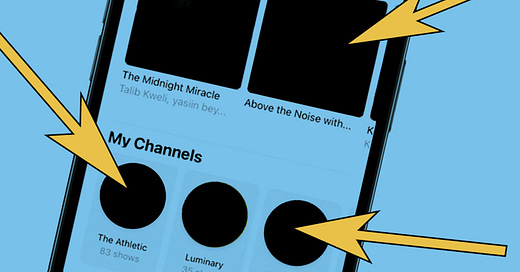
Are you using EVERY Apple Podcasts artwork opportunity?
Part 2 of 2 in an Apple Podcasts artwork special
Well hello!
Last week I detailed all the different places Apple podcasts displays your podcast artwork and promotional materials.
This week let’s talk about how to optimise your design materials to look their best in every position - including the one piece of podcast art almost nobody seems to get right.
In part, this is inspired by the work we’ve been doing at the New Statesman to redesign our podcast artwork in line with a new content plan we’re rolling out.
In the process of briefing the designers it became clear that although Apple give lots of guidelines on how to create artwork to display on the app, the specs appear in at least two places and the language used is pretty confusing.
I’ll try to demystify Apple’s confusing specs and show you some of the best examples I’ve found.
Let’s dive in.
Decoding Apple’s confusing specs
One of the most confusing things about Apple’s design specs is that you have a number of different variables to work with.
Artwork can be assigned to at least five different “levels”:
Show
Channel
Subscriptions
Episode
Chapter
There are at least three ways of getting artwork into Apple Podcasts (the submission method):
Upload artwork to your hosting platform, which is then picked up in Apple Podcasts and other players via RSS.
Upload artwork to Apple Podcasts directly via podcastsconnect.apple.com
Submit artwork to Apple Podcasts as a feature request via their submissions form.
Apple uses specific language to refer to different sizes and shape of artwork including, but not limited to:
Hero
Cover
Logo
Icon
Background
Upsell
Apple requires artwork to be uploaded in different file types depending on the type of artwork and the submission method.
So, to attempt to make it clearer I’ll break this into levels, then in to artwork types, and I’ll explain which submission methods and file types are required.
A couple of important points before we start:
Apple helpfully supplies safe margins for all artwork specs. Artwork displays at different sizes and in different configurations depending on where it appears and which device you are using. Make sure to keep all your important design elements within the art safe zones to ensure your artwork displays as you intend.
The best-designed podcasts use a cohesive design language across all iterations of their artwork to make their podcast easily identifiable wherever it the artwork is displayed. When you’re putting your suite of design assets together consider how they are visually connected to make your brand clear no matter where the user finds you.
The artwork you need to promote your SHOW
Show cover
What is it?
This is what most people think of when they think about podcast artwork. It’s your main podcast icon that appears on your show page. It’s also displayed in the following (and many more places besides):
Up Next
Subscriptions
Recommendations
Podcast charts
Episode play screen (if no episode art specified)
New and Noteworthy
The show cover should be clear, concise and establish the branding of your show. It is likely to be displayed at small sizes so don’t use lots of words or complicated images. Cut out the word ‘podcast’ from your feed art: users are accessing it in podcast apps, so they already know it’s a podcast!
Submission method: Add it in your podcast hosting platform. It will be picked up by Apple and other podcast players via RSS.
Size: 3000 x 3000 pixels
File type: .jpg or .png
Safe zones: pretty much the whole frame is safe. Easy peasy!
Full-page show art
What is it?
A version of your show cover art which appears across the whole screen on your feed page.
Your full page feed art could be subtly different from the show art which appears elsewhere. I particularly like how Off Menu have used the same design language and art direction, but chosen a different pose from their photoshoot. This is something that carries across their artwork versions - the same language but with subtle variations to keep it interesting.
Apple advise to keep the full page show art simple, and, of course, make sure you keep your key design elements within the safe zone.
Submission method: Full-page show art must be submitted as a promotional request to Apple, using their submission form. This means you can’t control whether or not they accept it - so make a good pitch!
Size: 2048 x 2732 pixels
File type: layered .psd (photoshop file)
Safe zones: Download the safe zone guides from Apple here: https://podcasters.apple.com/assets/full-page-show-template.zip
Show “Hero” feature image
What is it?
“Hero” is the name given to the large, rectangular image that sits at the top of Apple’s browse screen. It can only be submitted as a promotional request via the submission form.
This is prime promotional real-estate and hotly contested, so you need to make sure your pitch is compelling and your artwork meets the specifications.
Apple tend to feature show hero images when podcasts launch (or re-launch), otherwise they favour episode hero images (see below).
Apple needs minimum two weeks lead time for these slots, so if you want to time your feature request with a podcast launch make sure you submit in good time ahead of the launch date - the earlier the better.
The required canvas size is long and narrow - this is because the image can display differently on different screen sizes. You need to fill the whole canvas with art, but only place the most important design elements within the green area of the safe zone. The yellow area is reserved for graphic overlays applied by the user interface, so make sure you don’t place important design elements in that area.
Submission method: must be submitted as a promotional request to Apple, using their submission form.
Size: 2048 x 2732 pixels (fill the whole canvas with art)
File type: layered .psd (photoshop file)
Safe zones: Download the template from Apple here https://podcasters.apple.com/asset/show-hero-template.psd
The artwork you need to promote your CHANNEL
If you run more than one podcast, you can group them together in Apple Podcasts as a channel. Channels have their own artwork requirements and promotional opportunities.
Channel icon
What is it?
The equivalent of a profile pic on social media. A small, graphical symbol that displays across the Apple Podcasts app. It may be seen at small sizes so should be simple, clear and your branding should be easily recognised. Here’s the New Statesman’s channel icon:
Submission method: upload to your channel settings page in podcastsconnect.apple.com
Size: 3000 x 3000 pixels
File type: jpg or png
Safe zones: Download template from Apple here: https://podcasters.apple.com/assets/channel-icon-template.zip
Channel logo
What is it?
A transparent logo that sits at the top of your channel page. Every channel can display a logo, and by default you can choose a background colour using a colour picker or by inputting a hex ref. However it is possible to add a custom background to your channel page, but to do this you need to submit a promotional request. See “channel background” below.
Submission method: upload to your channel settings page in podcastsconnect.apple.com
Size: 3000 x 750 pixels
File type: transparent png
Safe zones: Download template from Apple here: https://podcasters.apple.com/assets/channel-logo-template.zip
Channel background
What is it?
Your opportunity to enhance the branding of your channel by adding custom artwork as a background to your channel logo, to display at the top of your channel page. It needs to be low-contrast and atmospheric - not busy, high contrast or cluttered. It can only be submitted via the submission form - you can’t upload it in settings.
Submission method: as a promotional request using the submission form.
Size: 4320 x 3240 pixels
File type: Layered psd
Safe zones: Download template from Apple here https://podcasters.apple.com/assets/channel-background-template.zip
The artwork you need to promote your SUBSCRIPTIONS
Subscriptions icon
What is it?
If you’re running paid subscriptions to your Apple Podcasts channel, you need to submit a subscriptions icon. This displays on the payment confirmation page.
Submission method: upload in settings
Size: 1080 x 1080 pixels
File type: jpg or png
Safe zones: The whole image is art safe! Hooray! Download the template from Apple here https://podcasters.apple.com/assets/promotional-banner-icon-template.zip
Subscriptions upsell
What is it?
When an unsubscribed user tries to play a piece of paywalled content, they are presented with your “subscriptions upsell” screen. This is an additional piece of branding designed to encourage them to part with their cash. The upsell image displays rather like the full page show art, filling the screen at the top of the page. Apple recommend the subscriptions upsell should feature the name of your subscriptions offering and be visually distinct from your shows and channels.
Submission method: submit a promotion request via the submissions form.
Size: 2048 x 2732 pixels
File type: Layered PSD
Safe zones: download the template from Apple here https://podcasters.apple.com/assets/subscription-upsell-template.zip
The artwork you need to promote your EPISODE
Episode art
OK, this is the one most people seem to get wrong.
What is it?
An icon that sits alongside an individual episode. Some podcasts choose to add different episode art to every single episode, others use it as a way of categorising episode types within a feed.
The beautifully-designed Louis Theroux podcast uses episode art to highlight the interviewee in each episode:
At the New Statesman we’re now using episode art as a means of categorising strands within the feed:
Other podcasts use bespoke episode art as a means of titling or illustrating the episode itself. Personally I do think this can lead to a rather cluttered-looking feed, so this is where I would advocate once again for considering a cohesive design language that ties all your artwork together.
Why do most people get it wrong? Because they don’t pay attention to the safe zones.
Unlike the feed art, episode art doesn’t always display as a whole square. In one extremely valuable iteration the episode art displays with an overlay which cuts off the bottom right corner.
What’s the first thing you see when you open the Apple Podcasts app? Up Next. These large rectangles are a powerful reminder to jump back in to your favourite shows where you left off.
But look at what happens when the Up Next carousel displays using episode art:
When the Up Next carousel displays episode art, it also displays the feed art as a little icon in the corner. This cuts off a portion of the episode art image. If you display text or a key design element here, it will overlap and look ugly.
Equally if your episode art isn’t designed to be cohesive with your overall colour scheme and design language it can clash with the feed icon horribly. Even my favourite design, the Louis Theroux podcast, hasn’t quite managed to get this right (although their clever art direction has avoided a colour clash).
Make sure to use the Apple-specified safe zones when putting your episode art together, to avoid a nasty clash!
Submission method: upload when creating a new episode in your podcast hosting platform. It will be picked up in Apple Podcasts and in other players via RSS.
Size: 3000 x 3000 pixels
File type: jpg or png
Safe zones: download the template from Apple here https://podcasters.apple.com/assets/episode-artwork-template.zip
Episode hero feature
What is it?
Just like the show hero image, you can submit a promotional request for Apple Podcasts to promote individual episodes of your show in their featured slots.
In fact, I’ve had most success pitching feature requests for individual episodes starring special guests, deploying the same design language as our feed art but in a unique configuration.
When Greta Thunberg guest edited the New Statesman, we produced an episode featuring Greta in conversation with Björk discussing the relationship between art and activism. Apple featured the episode in a top slot resulting in an uplift in downloads of around 75%.
As above, make sure you leave enough lead time to submit your promotion request at least two weeks before you want to promote your episode.
Submission method: must be submitted as a promotional request to Apple, using their submission form.
Size: 2048 x 2732 pixels (fill the whole canvas with art)
File type: layered .psd (photoshop file)
Safe zones: See the image below, from Apple’s specs
Chapter art
What is it?
Apple supports chapters within podcasts, and with each chapter you can include chapter-specific artwork which displays in the now playing and lock screens. Personally I’ve never tried this and I think there is a chance chapters could encourage people to skip ahead in your episode - but I would be keen to experiment so I might give it a go and report back. If you’ve tried chapters in Apple Podcasts and have some insights to share, let me know by reply to this email or in the comments on substack.
Submission method: Apple says: “specify chapters in the header of an MP4 file, or by modifying the ID3 tags of an MP3 or AAC file using third-party tools, such as Ferrite on iOS and iPadOS, Forecast by Overcast and Podcasts Chapters on macOS, and Vizzy on the web.”
Size: Square; 3000 x 3000 pixels
File type: JPEG or PNG
Actions you can take right now
Review your podcast artwork. Are you maximising the promotional opportunities within Apple podcasts?
Which of the artwork opportunities above could you leverage to further promote your show?
Submit a promotional request to promote your show or episode.
Worth your time
The branded podcast production company, Lower Street, have been running a really interesting series of “office hours” webinars.
This week they hosted an hour-long presentation by podcast marketer Jeremy Enns, founder of the Podcast Marketing Academy and author of the Scrappy Podcasting newsletter.
He talked about how he saw a 45% increase in listener growth after making just one small change to one of his clients’ podcast artwork.
You can watch the session here - and I strongly recommend signing up to attend future office hours sessions live so you get the full benefit of being able to interact and ask questions.
That’s all for this week. Have a great week of podcasting!
Until next time,
Chris.